

How to Spot Fake Graphs
Fake graphs pop up on social media all the time. And if graphs confuse you, you’re not alone—I’ve felt that way too! With all the lines, numbers, and labels, they can seem boring, messy, or even like they’re trying to trick you. But once you learn how to read them, graphs actually make things easier. They’re like a shortcut to show patterns or comparisons without a big wall of text. This guide will help you spot misleading and fake graphs faster—so you won’t fall for the tricks.
Why Even Use a Graph?
Sometimes, it’s the only way to clearly show trends, like how a population grows over time, or which animal is fastest. A good graph can explain in seconds what would take pages to describe. A fake or tricky graph can be super easy to misunderstand.
How to Read a Graph
Look at the Title
The title tells you what the graph is about. For example, “Favorite Ice Cream Flavors” or “Rainfall Over 12 Months.”
Look at the Source
- Is it recent data? If the data is old, it might not show what’s really going on right now.
- Is it from a trusted source, like a scientific journal? It’s time-consuming, but it’s important to check the original source.
- Have any fact-checking websites talked about this graph?
If they have, they might point out if something is wrong or misleading about it.
Check the Labels
Graphs usually have two sides:
- The x-axis (across the bottom) shows one thing, like time or categories.
- The y-axis (up the side) shows numbers or amounts.
Labels explain what each axis means.
Study the Data
Look at the bars, lines, or points on the graph. They show how much or how often something happens. Ask yourself:
- What is going up or down?
- Which is the biggest or smallest?
- Is there a pattern?
Reading a graph is like being a detective–you’re finding the story the data is telling?
Can a Graph be Fake?
- Yes—graphs can lie or be misleading. Here’s how:
- Missing labels: If you don’t know what the axes mean, the graph is useless.
- Weird scales: If the numbers on the y-axis jump in strange ways (like 0 to 1, then 1 to 100), it can make small changes look huge—or the other way around.
- Cherry-picked data: Some graphs only show part of the picture to support a certain idea.
- No source: If you don’t know where the data came from, be careful!
Examples of Misleading or Fake Graphs
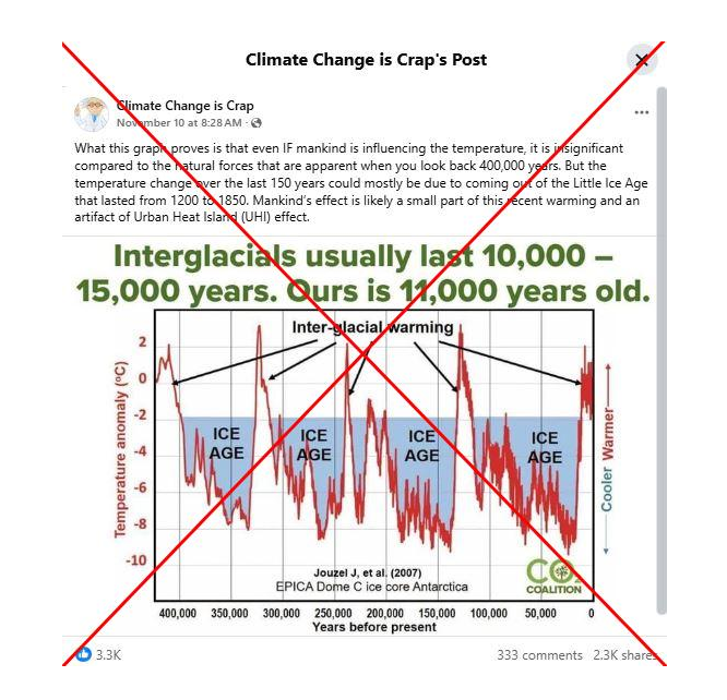
Look at the source: CO2 Coalition
Look up the source: This organization is run by ex-fossil fuel executives.
Check the scale: The graph shows tens of thousands of years—but leaves out the most important part: the sharp temperature rise caused by humans. Fossil fuel burning began around 1750, but the real effects didn’t show up until about 1850. That recent spike? Totally missing from the graph!
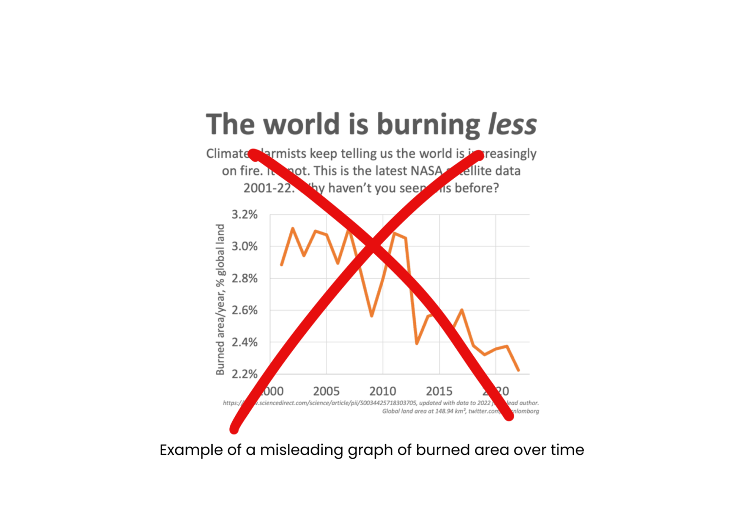
Look at the source: A legitimate research paper. Looks OK so far, right?
Go directly to the source: That graph isn’t even in the actual research paper. Someone took real data and turned it into something misleading. Hmmm….
What does the source show: “The C6 product detects 26% more burned area globally”. This means a satellite called MODIS found 26% more burned land around the world than we thought before. Pretty big difference, right? Don’t worry about the name “C6”—just know it’s part of how the satellite tracks fires from space.
Who posted this on social media: Bjorn Lomborg, a political scientist who denies human-caused climate change. He hasn’t published any scientific research about climate change.
These are just a few examples—there are actually thousands more out there. It’s a big problem, and it happens all the time.
If a graph seems too dramatic or feels like it’s trying to convince you of something, take a closer look. Ask: What is this graph really saying—and what might it be leaving out?
Best websites for fact-checking:
fake Keep an eye on my website’s fact check section: https://eco-nana.com/category/understanding-science/fact-check/
Last but not least: ask me to do the checking my sending me an email at econana1954@gmail.com.


You May Also Like

Fact-checking Series #3: Myths About Carbon Dioxide
Scientific Consensus: It’s Not a Vote, It’s the Evidence!
